WWU’s Patrick Buckley Analyzing Spread and Regional Patterns of Coronavirus Using Unique Set of Maps Called Cartograms
Geographers read the surface of the earth like historians read books, but Western Washington University’s Patrick Buckley isn’t interested in the boundaries of ancient Rome or the expansion of Genghis Khan’s Mongol empire – he is using a unique set of maps called cartograms to track the spread and growth of the coronavirus as it travels across the United States.
“COVID-19 is the perfect subject for cartographic analysis because of its rapid spread and the ability of maps to chart the progress of the virus itself and the impact of the policies and interventions that each state has taken, or not taken, to slow that spread,” said Buckley, a professor of Environmental Studies at Western.
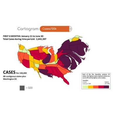
Buckley’s coronavirus cartograms aren’t like a typical Mercator projection map – they use the dataset underlying his analyses to distort the boundaries of the Lower 48 states to reflect the data of that cartogram; for example, a basic cartogram of population per state has New Jersey blown up in size to reflect its high population, while Montana or Wyoming are shrunk down to reflect their low populations.
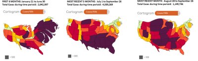
Buckley’s coronavirus cartograms are made up of two sets of maps, each with a grim underlying statistic: Cases per 100,000 residents, per state; and total deaths per 100,000 residents per state. Each set has a map for the total of the first six months of the pandemic, the most recent three months, and the past month of September. Users can chart the progress of the virus, from its landfall in the Northeast last winter to its summer explosion in the South and more recent spread into the more sparsely populated states of the Midwest.
Each state is not only distorted in size to show the impact of the virus or the number of deaths, but is also color coded light to dark, with dark showing the greatest virus impact.
The media is awash with maps on the virus, but the current ones fail to provide the ordinary citizen with a good analysis of the risk they currently face in their particular state, and the success, or lack thereof, of their state’s policies in addressing this pandemic.
“The media is awash with maps on the virus, but the current ones fail to provide the ordinary citizen with a good analysis of the risk they currently face in their particular state, and the success, or lack thereof, of their state’s policies in addressing this pandemic,” he said.
For example, Washington state, despite having the first recorded case in the nation last winter, has put policies in place that have kept its numbers at the cartograms’ lowest level of cases per 100,000 residents and second-lowest level of deaths. The policies of some states which were hit hard early in the pandemic such as New York have swung its caseload per 100,000 from being at the highest levels last winter to being at the lowest levels now. On the other hand, states that have put fewer policies in place to regulate the spread of the virus, such as Alabama, remain virus epicenters, and North Dakota has become a recent addition to the highest category in both cases and deaths per 100.000.
Buckley said as he began applying data to the cartograms, patterns began to emerge.
“COVID-19 has shown a very active movement across the country, effectively fleeing states with strong policies to contain it and racing into ones that had a false sense of spatial security based on distance from the coast or the highly urbanized areas of the Northeast,” he said. “Strong state policies work, and the Pacific Northwest is a perfect example. However, regional policy choices clearly mirror underlying political patterns, and, unfortunately, relate to COVID-19 risk.”
Buckley said it would be interesting to add Canada to the study to compare how its policies and results compare with those of its southern neighbor, and said he intends to continue updating his maps through the pandemic. He also added that cartograms as a general rule could be adapted and used as an accurate measuring stick for any geographically-bound entity such as cities or counties.
“My hope is that these maps can be an accessible tool for regular folks to get a clear understanding of how the state they live is dealing with the virus, and how policies put in place really do make a difference,” he said.
Data for this study was drawn from the New York Times github.com database, and the maps were produced using GoCart. For more information on his virus cartogram project, contact Buckley at Patrick.buckley@wwu.edu.